top of page
Warga Jamu, derived from warga (community) and jamu (Indonesia’s traditional herbal drink) is envisioned as a collective that carries and preserves the ritual of jamu for a new generation.
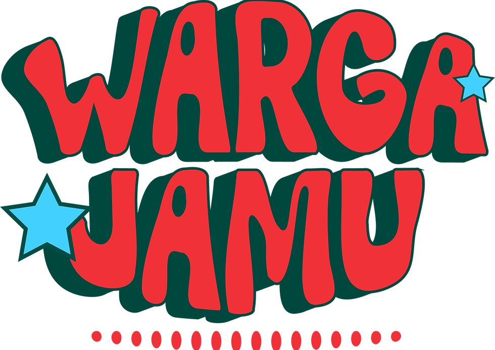
Vintage, groovy typography introduces a sense of nostalgia, contrasted with bold, vibrant colors that reflect the liveliness of jamu’s past era. Moving away from today’s muted, minimalist aesthetic, the concept reclaims a time when plant-based drinks were expressive, colorful, and deeply rooted in culture, bringing jamu back to the way it once was.
Warga Jamu
Client: Air Mancur | F&B | Visual Direction, Key Visual Development, Typography Proposal

Once a natural part of everyday life, jamu ads lived between TV shows, shop windows, and salon magazines. This project revisits that era, contrasting today’s muted wellness culture with a more vibrant, expressive past. The aim is simple: to stand out, embrace its presence unapologetically, and make jamu cool again.


On social media, this nostalgic energy is translated through
bold layouts, playful typography, retro-inspired illustrations, and vibrant color combinations that feel loud, warm, and alive. Drawing inspiration from vintage Indonesian advertisements, old packaging, salon posters, and television commercials, the visual system embraces maximalism and personality rather than restraint. Through expressive campaigns, educational content, and community-driven storytelling, Warga Jamu positions jamu not as an outdated tradition, but as a cultural ritual that feels relevant, approachable, and exciting for a younger
generation today.

Quisha Zata
quishazata.com
bottom of page